
Recently, I had the privilege of working on a project that pushed me far outside my comfort zone — and taught me invaluable lessons about what it truly means to design for real people.
The ‘Our Recovery’ program is funded by an MRFF (Medical Research Future Fund) grant. It’s a consumer-led online program that’s designed to help people with chronic pain develop better self-management strategies using Acceptance and Commitment Therapy (ACT) principles.
This wasn’t just another learning design project to me. It became a masterclass in inclusive design, technical problem-solving and the power of centring lived experience in everything we create.
Direct experience for authentic design
This project crystallised something I’ve been thinking about for the past year: people without direct experience of something struggle to be authoritative subject matter experts. We can all theorise about other people’s challenges, but there’s a world of difference between theoric knowledge and lived reality.
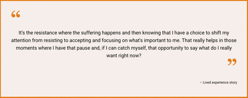
What made ‘Our Recovery’ extraordinary was that the content was designed by people with chronic pain for people with chronic pain. The co-designers brought authentic perspectives that no textbook could provide. They understood that:
- pain experiences are deeply individual – no one-size-fits-all approach works
- accessibility isn’t a checkbox – it’s about genuine usability for people in different states
- flexibility isn’t a nice-to-have – it’s essential when your audience might be lying down, unable to sit at a computer or dealing with unpredictable symptoms
The real-world design challenge
Here’s where theory met reality: how do you create online content for people who might not be able to sit at a computer or scroll through screens? Our solution was multi-modal by necessity. It included:
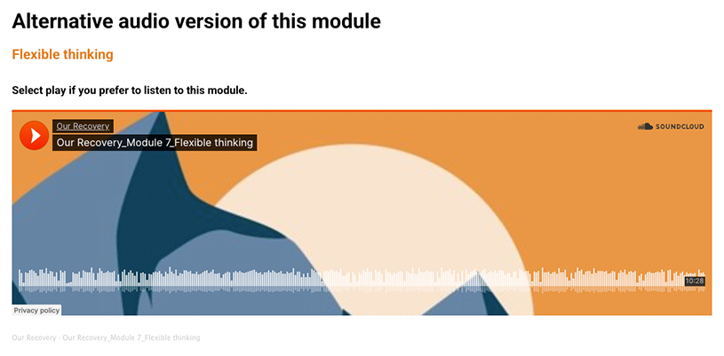
- written content with full audio versions
- downloadable workbooks for offline use when internet connections fail and to alleviate the effects of excessive screen time
- self-paced modules that users could pause and return to
- mobile-optimised design recognising that many users only have phone access
But achieving this wasn’t seamless. It required constant testing, platform evaluation and creative problem-solving. We initially tested a platform that seemed perfect – until we discovered it couldn’t handle basic accessibility features like marking images as decorative. This was a wake-up call about the gap between accessibility knowledge and platform capabilities.
Lesson learned: you can know everything about accessibility principles, but if your chosen platform doesn’t support essential features, you’re fighting an uphill battle.
Mobile-first: more than a buzzword
If you’re working from desks with large screens, it’s easy to forget that many users rely solely on mobile devices due to financial, geographical or physical constraints. If we’re going digital-first, we must go mobile-first.
The developer mode in browsers offers a good starting point for responsive design testing, but nothing replaces actual mobile testing. This should start from the very beginning to save headaches later in the process.
5 learning design takeaways
1. Centre lived experience
Don’t just consult with your target audience, make them co-designers. Their insights will reveal assumptions you didn’t know you had.
2. Test early, test often
MVP (Minimum Viable Product) culture often pushes accessibility and responsivity testing to the end. Resist this. Build testing into your process from Day 1.
3. Think beyond the desk
Your users may not be sitting at pristine workstations. They could be on phones, in bed, dealing with unreliable internet or managing complex life circumstances.
4. Platform choice matters
Evaluate platforms not just for features, but for their accessibility and responsivity support. A beautiful interface means nothing if users can’t access it.
5. Embrace constraints as creative catalysts
Technical limitations may force you to think more creatively about content delivery. This can lead to solutions that serves users better what was originally planned.
The bigger picture
This project reinforced why I love working in learning design at UTS, where “it can’t be done” isn’t an option. Every constraint became an opportunity to innovate; every technical challenge pushed us to find better solutions. More importantly, it reminded me that good design isn’t about what we think users need. It’s about deeply understanding and responding to what they actually experience.
What challenges have you faced when designing for diverse user needs? How do you ensure your learning designs truly serve the people they’re meant to help? I’d love to hear your experiences in the comments.
Feature image by Josie Mercer
Giulia, it was such a pleasure working alongside you on this project. I really valued your open mind, curiosity, and flexibility – qualities that are so essential for inclusive design. You’ve captured the learnings so eloquently, and it was fabulous to share this journey with you.