
Co-authored by Ariane Wicks, Sonia Matiuk and Kathy Egea
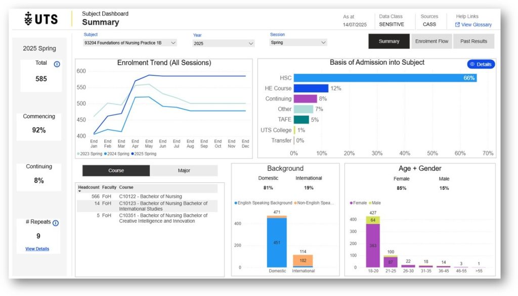
The Student 360 Subject Dashboard is a Power BI interactive dashboard within Student 360, providing a snapshot of your student cohort for each subject you coordinate in the current session. It presents daily data drawn from CASS on enrolment trends, entry pathways, demographics, and past performance to support subject planning, teaching, and review.
We’ve previously explored how coordinators have used the dashboard to enhance their teaching. In this post, we’ll revisit some of the main features of the dashboard and explore some of the new functions that allow you to gain greater insights about your student cohorts. We’ll also share some examples of how UTS staff have been using the tool.
1. Who can see the dashboard?
Only subject coordinators teaching in the current session have access to and visibility of the dashboard. Subject coordinators can view current and past iterations of their current subject(s) up to three years ago (a new feature). However, displays of subjects taught in past sessions are not available, unless they are part of the current or future sessions in the current year.
2. What does it allow us to do?
With the dashboard, you can:
- Track subject enrolments in the lead up to census dates
- Better understand the diversity of the cohort to inform inclusive design decisions
- Analyse and evaluate student performance at the end of the session
- Evaluate the impact of curriculum redesign or pedagogical intervention on student performance
Nursing lecturer Sonia Matiuk uses the dashboard to analyse cohort trends across multiple years of a subject. Observing an increase in international students, she can tailor her lessons to provide more context about the Australian healthcare system for students who may not be familiar with it.
I like to see what the cohort is made up of in preparation to see if I can cater to any changes in the cohort – for example I’m aware this year we have more international students than we did last year. I also like to have an idea of how many students are repeating the subject so I can attempt to support them with success on this attempt at the subject. Sonia Matuik – watch her case study
3. When should I use it?
The dashboard has practical uses throughout the teaching session, depending on your needs.
- Before the session starts, you can use the dashboard to tailor your teaching approach based on the cohort
- During the session, it can help with monitoring enrolment patterns and identifying emerging issues
- After the teaching session has concluded, the dashboard can help with reflecting on trends in subject results and informing future improvements
Senior Learning Designer Ariane Wicks and her team use the dashboard early in their discovery process to build a clear understanding of each cohort before meeting with the subject coordinator. After the teaching session has concluded, the team revisits the dashboard in post-delivery reviews to guide future improvements.
I often run the report for my team to highlight enrolment patterns, repeat rates, and student backgrounds. This helps us identify potential risks or opportunities, such as tailoring content for a largely first-year or cross-disciplinary cohort, or addressing subjects with high failure rates. Ariane Wicks – watch her case study
4. Is the data real-time?
Yes. Enrolment data is updated daily from CASS. Performance data, however, is only available after session results are released in CASS.
5. Is the data anonymous?
Yes – the dashboard presents de-identified, aggregate data. However, a 2025 change will mean subject coordinators can view the repeat student details and subjects being repeated in the current session. This aligns with the Support for Student Policy (4:16) by supporting subject coordinators, prior to the session and before the census date, to reach out to these students and put practices in place to support their future success.
6. Can I share the data with others?
Subject coordinators are welcome to share dashboard outputs with their teaching teams (image of screens, exported reports, etc.). For students, we suggest sharing the summary screen as a way to normalise diversity. You may also like to show past results, along with any reflections on curriculum changes.
7. Is it used to evaluate my teaching?
No. The dashboard is a quality enhancement tool, not a performance management tool. It’s designed to support you in improving student experience and outcomes, and the data could be used to support applications for T&L awards and/or promotion.
The subject dashboard does not draw on SFS data or Canvas subject data.
8. How do I access it?
Currently, you need to:
- Be listed as the Subject Coordinator for a subject in CASS
- Access the dashboard via the Student 360 app through Power BI
- PowerBI (https://app.powerbi.com) or via Microsoft Office 365
- Use your UTS login (SSO via OKTA)
9. What if I don’t have access or need help?
If you can’t access the Student 360 Subject Dashboard, and you are a current subject coordinator:
- Submit a request via ServiceConnect for the Data Analytics and Insights Unit, request subject dashboard access, and indicate the subject/s number and title.
If you would like to know more, this short video demonstrates key features of the dashboard (including recent updates). For further support, contact Kathy.egea@uts.edu.au.