
At an EduTech Summit panel on Enabling Inclusive and Accessible Education, I opened with a metaphor: accessibility is the door, and inclusion is the welcome. But what I also raised during the discussion was a persistent assumption — that inclusive design and innovation pull in different directions. I want to respectfully challenge that idea.
The most transformative learning design doesn’t begin at the centre. It begins at the margins, with learners whose needs are most urgent and least anticipated. When we design with them in mind, we don’t constrain innovation — we unlock it.
Inclusion as a catalyst, not a constraint
Inclusive design is often cast as the logistical side of education — about meeting policy or minimum standards — while innovation is framed as aspirational and blue-sky. But this is a false binary. Both are deeply creative responses to complexity. CAST co-founder David Rose described Universal Design for Learning (UDL) as “designing for variability” — and variability is the raw material of innovation.
In the Education Portfolio‘s Learning Design Team, we employ this across our digital learning ecosystem. Acknowledging the breadth of learner backgrounds, we design for flexible modes of engagement, representation, and expression. We use interactives, video explainers and simulations not for novelty, but because dual coding theory (Paivio, 1986) shows that pairing visual and verbal information enhances memory and comprehension.
For some students with ADHD, cognitive fatigue or language barriers, visual scaffolds can help decode dense concepts. For those with limited bandwidth, vision impairment or screen fatigue, we provide structured, text-based equivalents. These aren’t just alternatives – they’re parallel pathways to understanding. This reflects the heart of UDL: providing multiple means to the same end.
When learners vary, our designs must too. These design decisions serve neurodivergent learners, first-in-family students, carers and adult learners, but also improve usability for all learners. Inclusive design is not just equitable; it’s elegant.
The Rubik’s Cube analogy: inclusion by design
To illustrate the difference between accommodation and full inclusion, I often return to a metaphor from UDL discourse (Meyer & Rose, 2014): the evolution of the Rubik’s Cube.
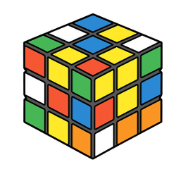
- The original Rubrik’s Cube uses colour alone – fine for sighted users, but inaccessible to those with low vision or colour vision deficiency.
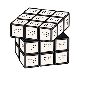
- The Braille version replaces colour with tactile labels – usable by blind students but separate from the experience of their sighted peers.
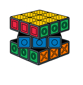
- The Touch Cube has labels that are both coloured and tactile labels (e.g. a blue square is also a circle, an orange square is also an X). Everyone can play – together.
This is the shift from retrofits to design that anticipates variability. It asks not “How do we fix this?” but “How do we build something that works for all from the start?”
Disability advocate Liz Jackson critiques superficial solutions as “disability dongles”: well-meaning but impractical fixes designed without disabled users in mind. True inclusion should empathise with all users from the outset.
In the Learning Design Team we’re not just accommodating — we’re designing inclusively from the ground up. Like the Touch Cube, our designs offer multiple points of access to the same cognitive challenge — without compromising rigour or richness.
Grounded examples
Our team’s professional learning program, Innovation Lab, embodies this ethos. Through our Idea Accelerator program, cross-functional teams prototype solutions to real-world challenges. Teams are:
- exploring how to increase belonging for students in large online cohorts
- reimagining secure assessments to emphasise learning as a process – not just a product
- investigating how to embed future-focused skills in ways that feel purposeful, not tokenistic
These are grounded, scalable innovations shaped by empathy and experimentation.
Writing for inclusive UX
Even the way we write matters. I suggest that we avoid assumptions about technology or physical ability by using terms like ‘select’ instead of ‘click’, and ‘choose the correct response’ instead of ‘drag and drop’.. We should also avoid cultural and heteronormative assumptions in language by choosing terms and examples that reflect diverse identities and relationships, as explored in our SPECTRA initiative.
These micro-decisions, layered consistently, change how learners relate to content, tools and themselves.
From compliance to co-creation
Inclusion often starts with compliance: captions, alt text, semantic HTML. These are essential, but they are only the beginning.
We are moving toward co-creation by exploring ways to consult meaningfully with our unit’s Student Learning Advisory Committee (SLAC), which is organised by the Inclusive Practices Team to inform our wider design practices. Inclusion thrives on feedback loops; not just surveys, but dialogue.
In a recent collaboration with the Graduate School of Health and Our Recovery, we were fortunate enough to be involved in a project where we co-designed modules with people with lived experience of chronic pain and illness. They helped us shape:
- short, modular lessons (<15 minutes), so learners can dip in and out when energy allows
- an interactive PDF workbook that mirrors online content (so offline study is possible)
- audio versions of each module, accessible via streaming or download
Every design decision was informed by experience, not assumption.
Designing from the edges
Innovation doesn’t begin at the centre. It begins at the edges, where the challenges are sharper and the so-called ‘defaults’ don’t apply. When we centre the margins, we don’t dilute the experience — we deepen it. And we create systems that are more adaptable, humane, and future-fit for everyone.
This is a fabulous post Amelia – so cleverly explained linking Universal Design for Learning to real ways to demonstrate how designing for the edge includes all voices and therefore far greater potential for innovation and creativity.